Chart tab
The time series graph is displayed when the Chart tab is open.
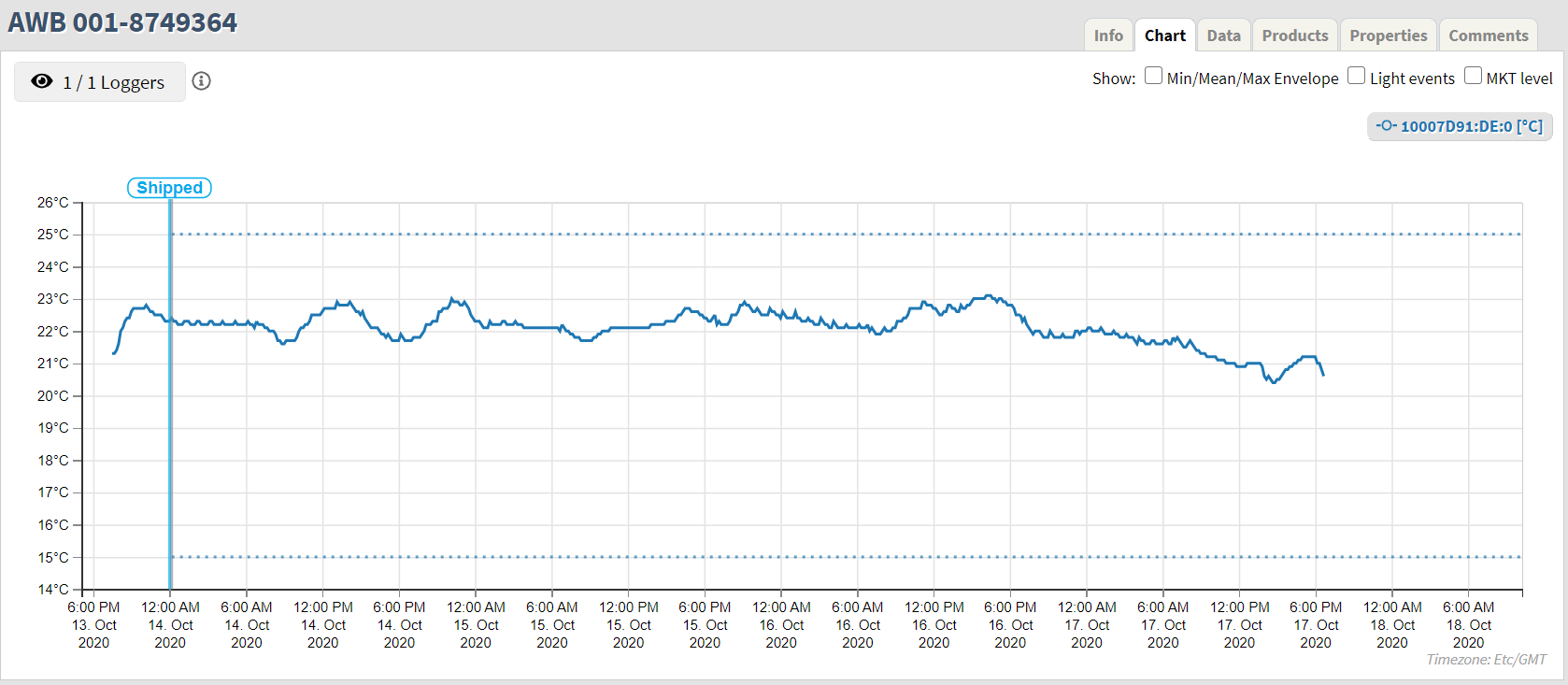
If there is only one logger in the shipment the system will load and display all the data from the logger. See below.
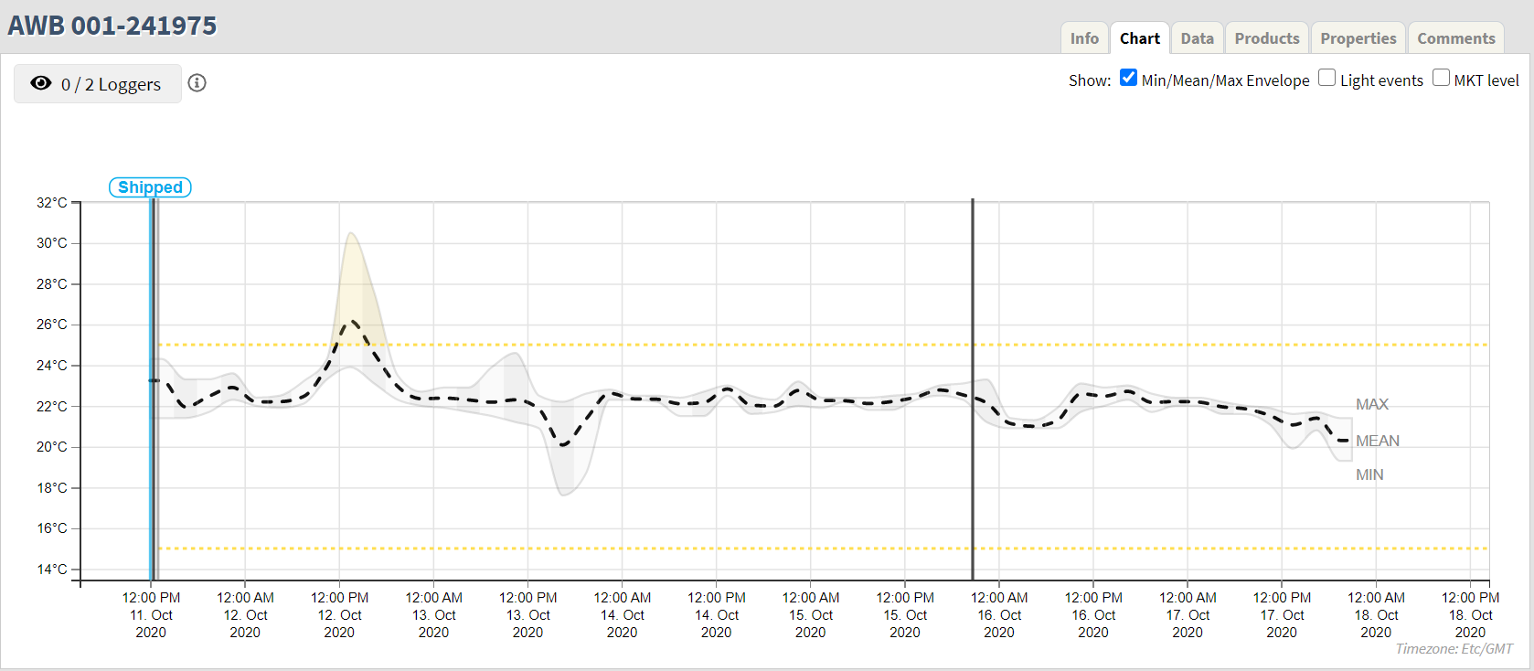
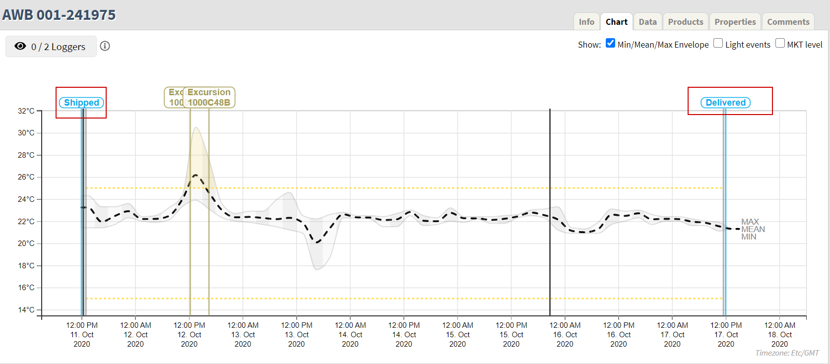
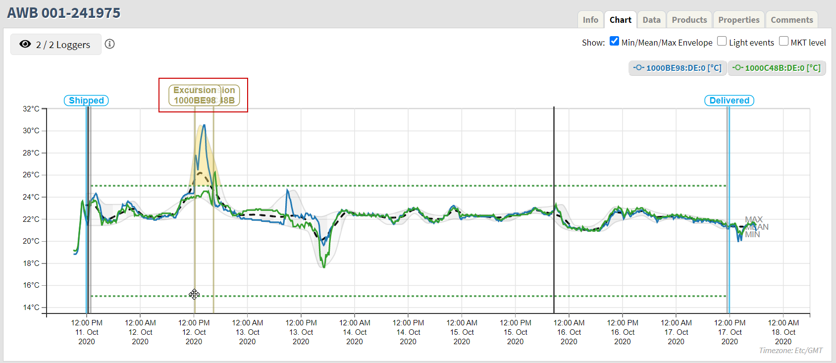
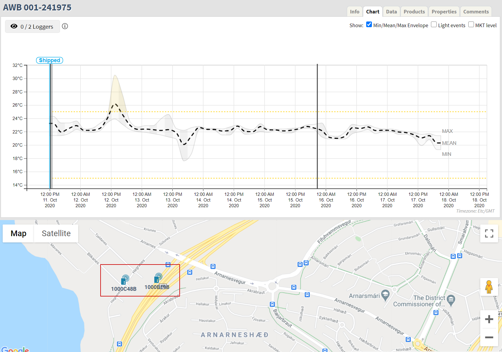
If there is more than one logger in the shipment, the system will load aggregated values from all the loggers in the shipment and display as an Envelope of minimum and maximum values, showing the mean values as a dashed line. See below.
Controls in the Chart tab
Select loggers
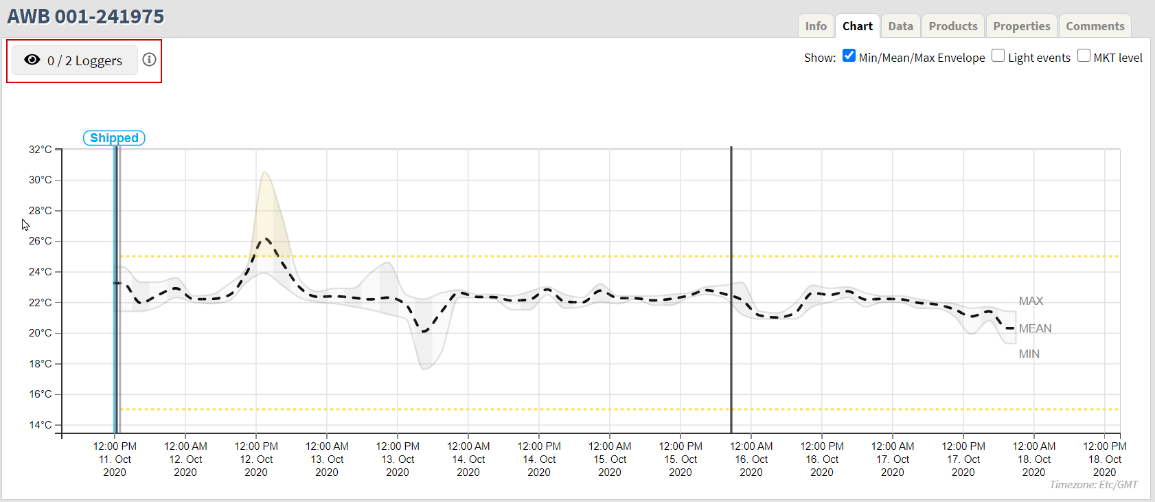
Select which loggers to display by using the Loggers selector. See marked in red below.
Click the button and select the logger(s) to display on the graph. A maximum of six (6) loggers can be selected.
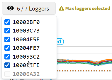
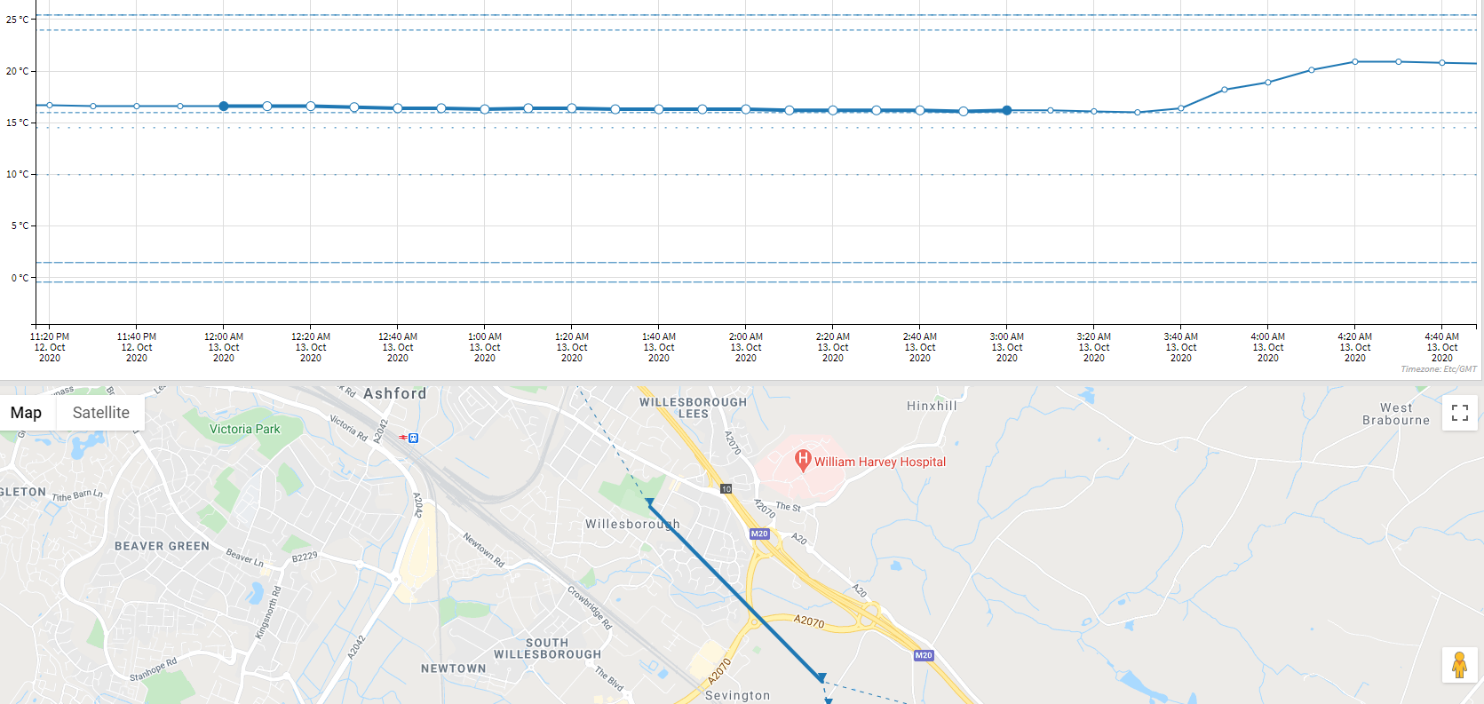
Once a logger has been selected, temperature measurements from the logger will be loaded into the system and displayed on the chart. Simultaneously, location data from the selected logger(s) is loaded and the logger location trace is shown on the map.
Zoom in/out
Zoom in and out on the chart using the scroll wheel on a mouse or touchpad, if using a laptop.
Pan the chart, right or left, by clicking and holding the left mouse button while in the chart area. Move the cursor around to find the necessary information.
By zooming in on the chart the logger data points become visible. Data points with color fill indicate measurements where location data is also available.
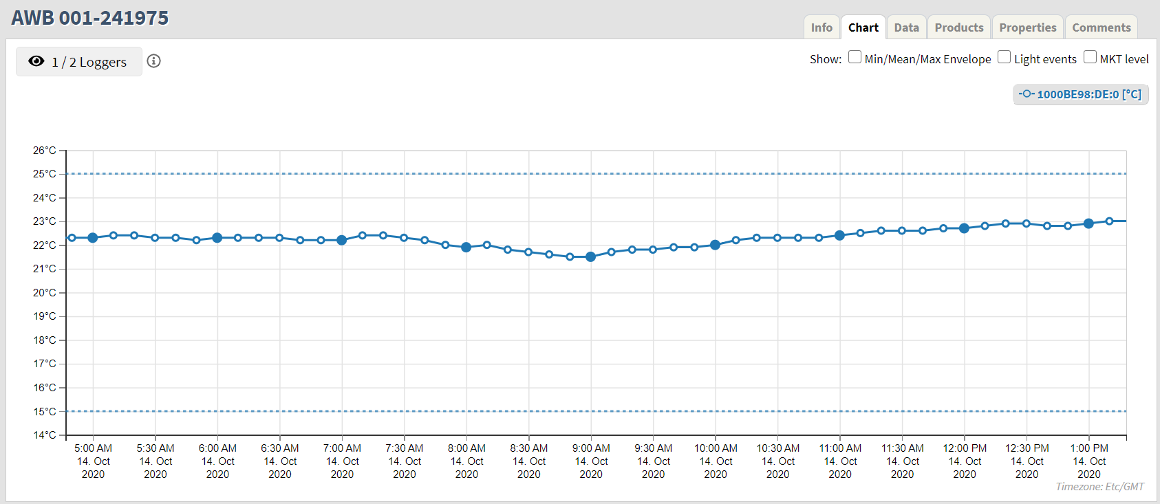
An example of a data point with color fill is at at 10:00 AM on the chart above.
Shipment events
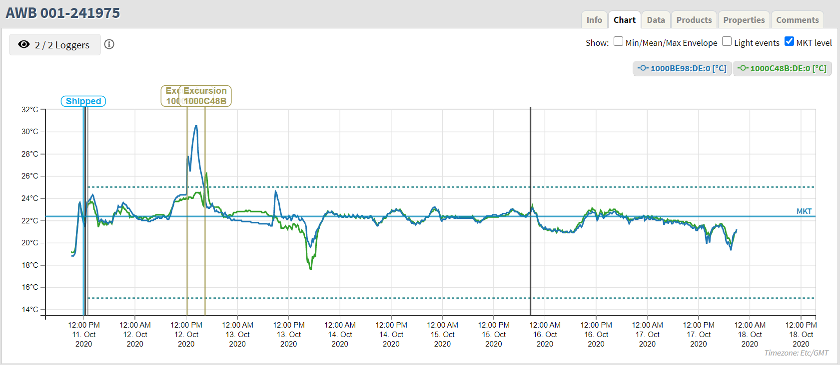
Shipment events are indicated by vertical lines and a bubble describing the type of event. The following shipment events can be found on the chart. See the chart below.
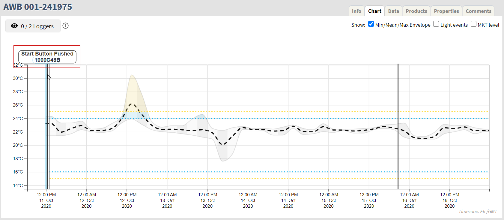
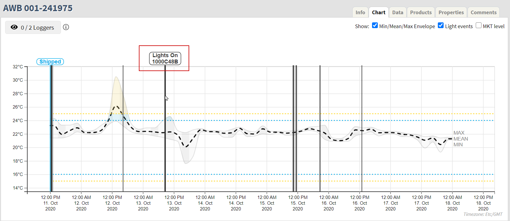
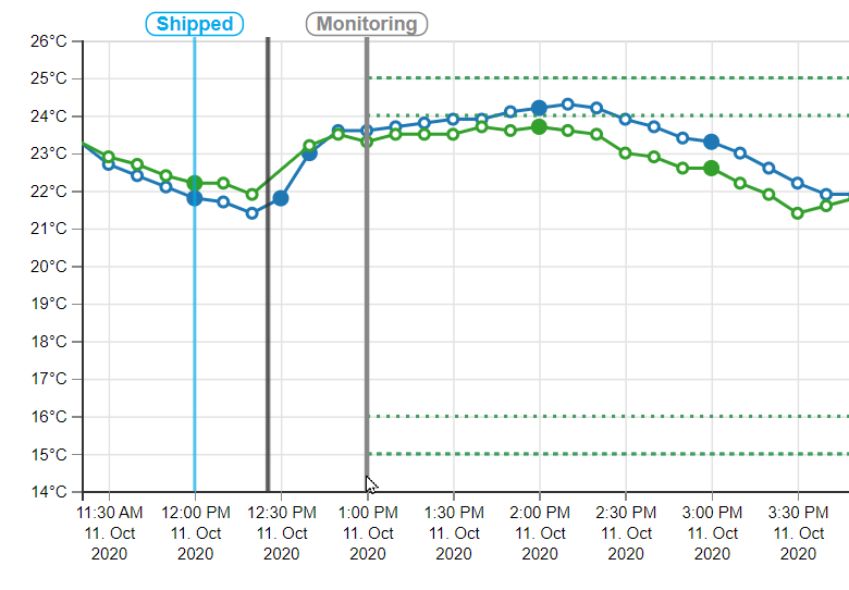
Shipped: Indicates when the first logger was successfully started. A shipped event is always shown in light blue color on the chart if the shipment has been shipped.
Monitoring: Indicates the time when monitoring started on the first logger that was successfully shipped. See Ignore period. Hover over the line to display the info bubble for this event. Bubble is not shown by default.
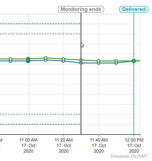
Monitoring ends: Indicates the time when monitoring ended on the last logger that was successfully delivered. See Ignore period. Hover over the line to display the info bubble for this event. Bubble is not shown by default.
Delivered: Indicates when the last logger was successfully delivered. Delivered event is always shown in light blue color on the chart if the shipment has been delivered.
Logger events
Logger events are reported by individual loggers. When hovering over a vertical line representing a logger event a bubble with the type of event and corresponding logger ID will appear.
This is true for all logger events except for Medium and High level excursion. The info bubble for those types of events will always be visible on the chart.
The following events exist for loggers:
Excursion events: Indicates when a temperature has breached a temperature boundary defined in the shipment, and sent to the logger. The Excursion events are color-coded based on the severity of the excursion:
Notification: Dark green
Low severity: Blue
Medium severity: Yellow
High severity: Red
Button events: Indicates when the Start or Stop button were pressed on the logger. These events are indicated by black vertical lines.
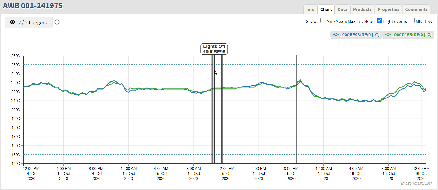
Light events: Indicate light on and light off events.
Ignore period
Ignore period in the beginning of a shipment is the time between the Shipped event and the Monitoring event. The excursion boundaries are not applied until after the ignore period.
It is also possible to define ignore period at the end of a shipment, and it is shown in the same manner as at the beginning of a shipment.
Show options
It is possible to show and hide several of the features displayed on the chart.
 |
Min/Mean/Max Envelope
The Min/Mean/Max Envelope is always selected on initial load, except when there is only one logger in the shipment.
The Envelope is created by aggregating values from all loggers in the shipment in so-called time buckets. The default bucket size is three (3) hours - but will increase in size in accordance to the duration of shipments. For default time bucket size, the system will therefore return the minimum, mean, and maximum values from all the loggers in the shipment.
See below a chart showing Min/Mean/Max Envelope.
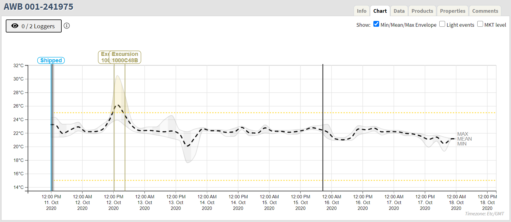
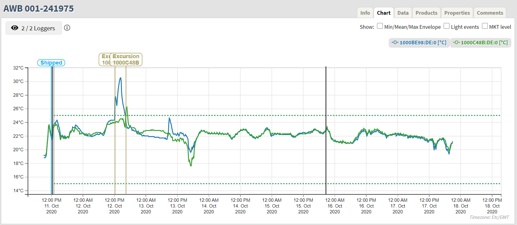
The same shipment shown without the Min/Mean/Max Envelope is not selected.
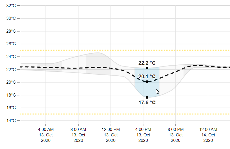
By hovering over a specific Time Bucket of the Min/Mean/Max Envelope the corresponding aggregated values are shown for that bucket.
Light events
Selecting Light events will display all light events, Lights on and Lights off, on the chart. Each event is indicated with a black vertical line. By hovering over a specific event a bubble will appear displaying the type of event and the associated logger ID.
MKT Level
By selecting the MKT (Mean Kinetic Temperature) level a blue horizontal line is displayed indicating the current MKT value.
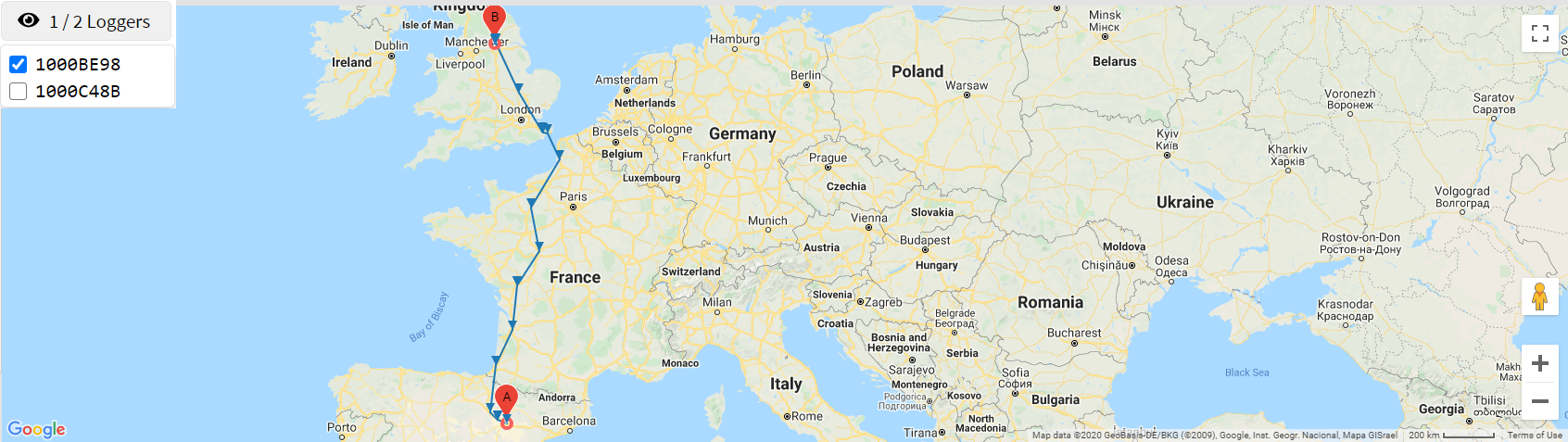
Logger location
Upon the initial load of the Chart tab the last reported position of the logger is displayed on the map.
Once a logger has been selected to be displayed on the chart all location points are loaded and displayed on the map - connected with a line to indicate the path travelled by the logger.
By clicking on a location data point on the temperature chart a red pin will appear on the map indicating the position at the time of the measurement.
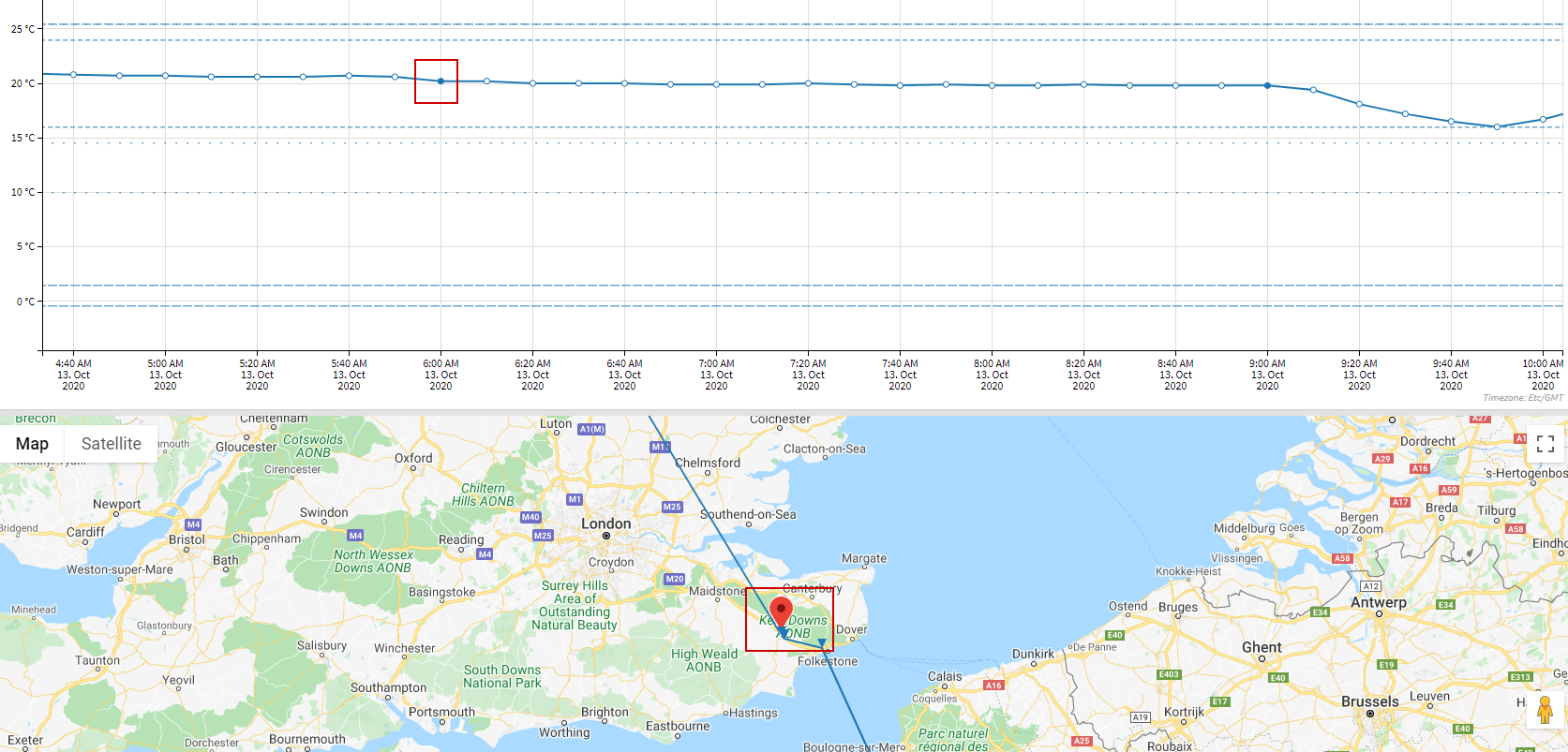
By clicking on a data point without location data, the segment between the previous location and the next location is highlighted on the chart and on the map.